This is a follow up post to something I wrote a few months ago, on the topic of AI in Actuarial Science. Over the intervening time, I have been writing a paper for the ASSA 2018 Convention in Cape Town on this topic, a draft of which can be found here:
https://papers.ssrn.com/sol3/papers.cfm?abstract_id=3218082
and code here:
https://github.com/RonRichman/AI_in_Actuarial_Science
I would value feedback on the paper from anyone who has time to read the paper.
This post, though, is about the process of writing the paper and some of the issues I encountered. Within the confines of an academic paper it is often hard, and perhaps mostly irrelevant, to express some thoughts and opinions and in this blog post I hope to share some of these ideas that did not make it into the paper. I am not going to spend much time defining the terms too much, and if you refer to the paper if some terminology is unclear I think it will help to clarify.
Vanilla ML techniques might not work
Within the paper I try to apply deep learning to the problem addressed in the excellent tutorial paper of Noll, Salzmann and Wüthrich (2018) which is about applying machine learning techniques to a French Motor 3rd Party Liability (MTPL) dataset. They achieve some nice performance boosts over a basic GLM with some hand engineered features using a boosted tree and a neural network.
One of the biggest shocks that I had was when I decided to try this problem myself is that off the shelf tools like XGboost did not work well at all – in fact, the GLM was by far better despite the many hyper-parameter settings that I tried. I also tried out the mboost package but the dataset was too big for the 16gb of RAM on my laptop.
So the first mini-conclusion is that just because you have tabular data (i.e. structured data with rows for observations and columns for variables, like in SQL), you should not automatically assume that a fancy ML approach is going to outperform a basic statistical one. Anecdotally, I am hearing from several different people that applying vanilla techniques to pricing problems doesn’t provide much performance boost.
To this point, I recommend Frank Harell’s excellent blog post on ML versus statistical techniques, and about when to apply which:
http://www.fharrell.com/post/stat-ml/
Vanilla DL techniques might not work either
This was perhaps the most vexing part of the process. Fitting deep networks with ReLu activations to the French dataset, like the more up to date sources on deep learning seem suggest, also did not work all that well! In fact, I achieved only poor performance on a network fit to data without manual feature engineering. Another issue is that depth didn’t seem to help all that much.
Similarly, naively coding up deep autoencoders for the mortality data that is also discussed in the paper turned out to be a major learning when writing the paper – these just did not converge despite the many attempts at tuning the hyperparameters. I only managed to find a decent solution using greedy unsupervised learning (Hinton and Salakhutdinov 2006) of autoencoder layers.
Therefore a conclusion if you encounter a problem to which you want to apply Deep Learning – be aware that ReLus plus depth might not work and you might need to dig into the literature a bit!
When DL works, it really works!
This is connected to the next idea. Once I found a way of training the autoencoders, the results were fantastic and by far exceeded my expectations (and the performance of the Lee-Carter benchmark for mortality forecasting). Also, once I had the embedding layers working on the French MTPL dataset, the results were better than any other technique I could (or can) find. I was also impressed by the intuitive meaning of the learned embeddings, which I discuss in some detail in the paper, and the fact that plugging these embeddings back into the vanilla GLM resulted in a substantial performance boost.
The flexibility of the neural networks that can be fit with modern software, like Keras, is almost unlimited. Below is what I call a “learned exposure” network which has a sub-network to learn an optimal exposure measure for each MTPL policy. I have not encountered a similarly flexible and powerful system in any other field of statistics or machine learning.

Is this really AI?
One potential criticism of the title of the paper is that this isn’t really AI, but rather fancy regression modelling. I try to argue in Section 3 of the paper that Deep Learning is an approach to Machine Learning whereby you allow the algorithm to figure out the features that are important (instead of designing them by hand).
This is one of the desiderata for AI listed by Bengio (2009) on page 10 of that work – “Ability to learn with little human input the low-level, intermediate, and high-level abstractions that would be useful to represent the kind of complex functions needed for AI tasks.”
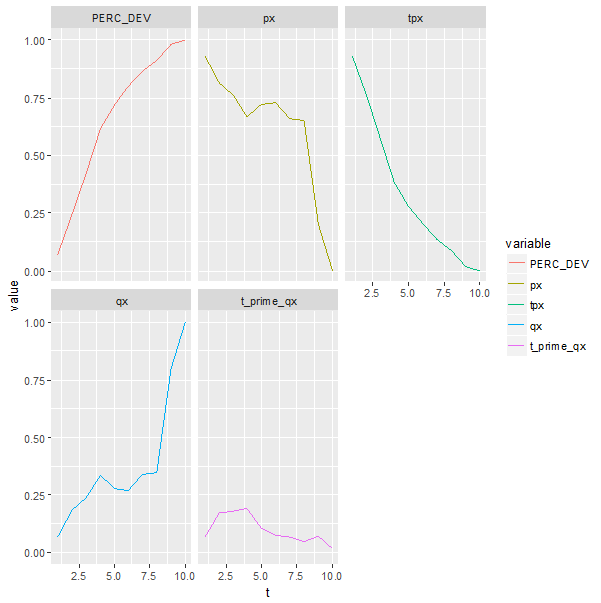
Do I think that my trained Keras models are AI? Absolutely not. But, the fact that the mortality model has figured out the shape of a life table (i.e. the function ax in the Lee-Carter model) without any inputs besides for year/age/gender/region and target mortality rates should make us pause to think about the meaningful features captured by deep neural nets. Here is the relevant plot from the paper – consider “dim1”:

This gets even more interesting in NLP applications, such as in Mikolov, Sutskever, Chen et al. (2013) who provide this image which shows that their deep network has captured the semantic meaning of English words:

Also, that deep nets seem to be able to perform “AI tasks” (the term used by Bengio, Courville and Vincent (2013) to mean tasks “which are challenging for current (shallow, my addition) machine learning algorithms, and involve complex but highly structured dependencies”) such as describing images indicates that something more than simple regression is happening in these models.
DL is empirical, not yet scientific
An in joke that seems to have made the rounds is so-called “gradient descent by grad student” – in other words, it is difficult to find optimal deep learning models and one needs to fiddle around with designs and optimizers until something that works is found. This is much easier if you have a team of graduate students who can do this for you, thus the phrase quoted above. What this means in practice is that there is often no off the shelf solution, and little or no theory to guide you in what might work or not, leading to lots of experimenting with different ideas until the networks perform well.
AI in Actuarial Science is a new topic but there are some pioneers
The traditional actuarial literature has not seen many contributions dealing with deep neural networks, yet. Some of the best work I found, which I highly recommend to anyone interested in this topic, is a series of papers by Mario Wüthrich and his collaborators (Gabrielli and Wüthrich 2018; Gao, Meng and Wüthrich 2018; Gao and Wüthrich 2017; Noll, Salzmann and Wüthrich 2018; Wüthrich 2018a, b; Wüthrich and Buser 2018; Wüthrich 2017). What is great about these papers is that the ideas are put on a firm mathematical basis and discussed within the context of profound traditional actuarial knowledge. I have little doubt that once these ideas take hold within the mainstream of the actuarial profession, they will have a huge impact on the practical work performed by actuaries, as well as on the insurance industry.
Compared to statistical methods, though, there are still big gaps in understanding the parameter/model risk of these deep neural networks and an obvious next step is to try apply some of the techniques used for parameter risk of statistical models to deep nets.
The great resources available to learn about and apply ML and DL
There are many excellent resources available to learn about Machine and Deep Learning that I discuss in the resources sections of the paper, and, best of all, most of these are free, except for opportunity costs.
Lastly, a word about Keras , which is the high level API that makes fitting deep neural models easy. This is a phenomenally well put together package, and the R interface makes it much more accessible to actuaries who might not be familiar with Python. I highly recommend Keras to anyone interested in experimenting with these models, and, Keras will be able to handle most tasks thrown at it, as long as you don’t try anything too fancy. One thing I wanted to try, but couldn’t figure out was how to add an autoencoder layer to a supervised model where the inputs are the outputs of a previous layer, and this is one of the few examples where I ran into a limitation in Keras.
References
Bengio, Y. 2009. “Learning deep architectures for AI”, Foundations and trends® in Machine Learning 2(1):1-127.
Bengio, Y., A. Courville and P. Vincent. 2013. “Representation learning: A review and new perspectives”, IEEE transactions on pattern analysis and machine intelligence 35(8):1798-1828.
Gabrielli, A. and M. Wüthrich. 2018. “An Individual Claims History Simulation Machine”, Risks 6(2):29.
Gao, G., S. Meng and M. Wüthrich. 2018. Claims Frequency Modeling Using Telematics Car Driving Data. SSRN. https://papers.ssrn.com/sol3/papers.cfm?abstract_id=3102371. Accessed: 29 June 2018.
Gao, G. and M. Wüthrich. 2017. Feature Extraction from Telematics Car Driving Heatmaps. SSRN. https://papers.ssrn.com/sol3/papers.cfm?abstract_id=3070069. Accessed: June 29 2018.
Hinton, G. and R. Salakhutdinov. 2006. “Reducing the dimensionality of data with neural networks”, Science 313(5786):504-507.
Mikolov, T., I. Sutskever, K. Chen, G. Corrado et al. 2013. “Distributed representations of words and phrases and their compositionality,” Paper presented at Advances in neural information processing systems. 3111-3119.
Noll, A., R. Salzmann and M. Wüthrich. 2018. Case Study: French Motor Third-Party Liability Claims. SSRN. https://ssrn.com/abstract=3164764 Accessed: 17 June 2018.
Wüthrich, M. 2018a. Neural networks applied to chain-ladder reserving. SSRN. https://papers.ssrn.com/sol3/papers.cfm?abstract_id=2966126. Accessed: 1 July 2018.
Wüthrich, M. 2018b. v-a Heatmap Simulation Machine. https://people.math.ethz.ch/~wueth/simulation.html. Accessed: 1 July 2018.
Wüthrich, M. and C. Buser. 2018. Data analytics for non-life insurance pricing. Swiss Finance Institute Research Paper. https://ssrn.com/abstract=2870308. Accessed: 17 June 2018.
Wüthrich, M.V. 2017. “Covariate selection from telematics car driving data”, European Actuarial Journal 7(1):89-108.